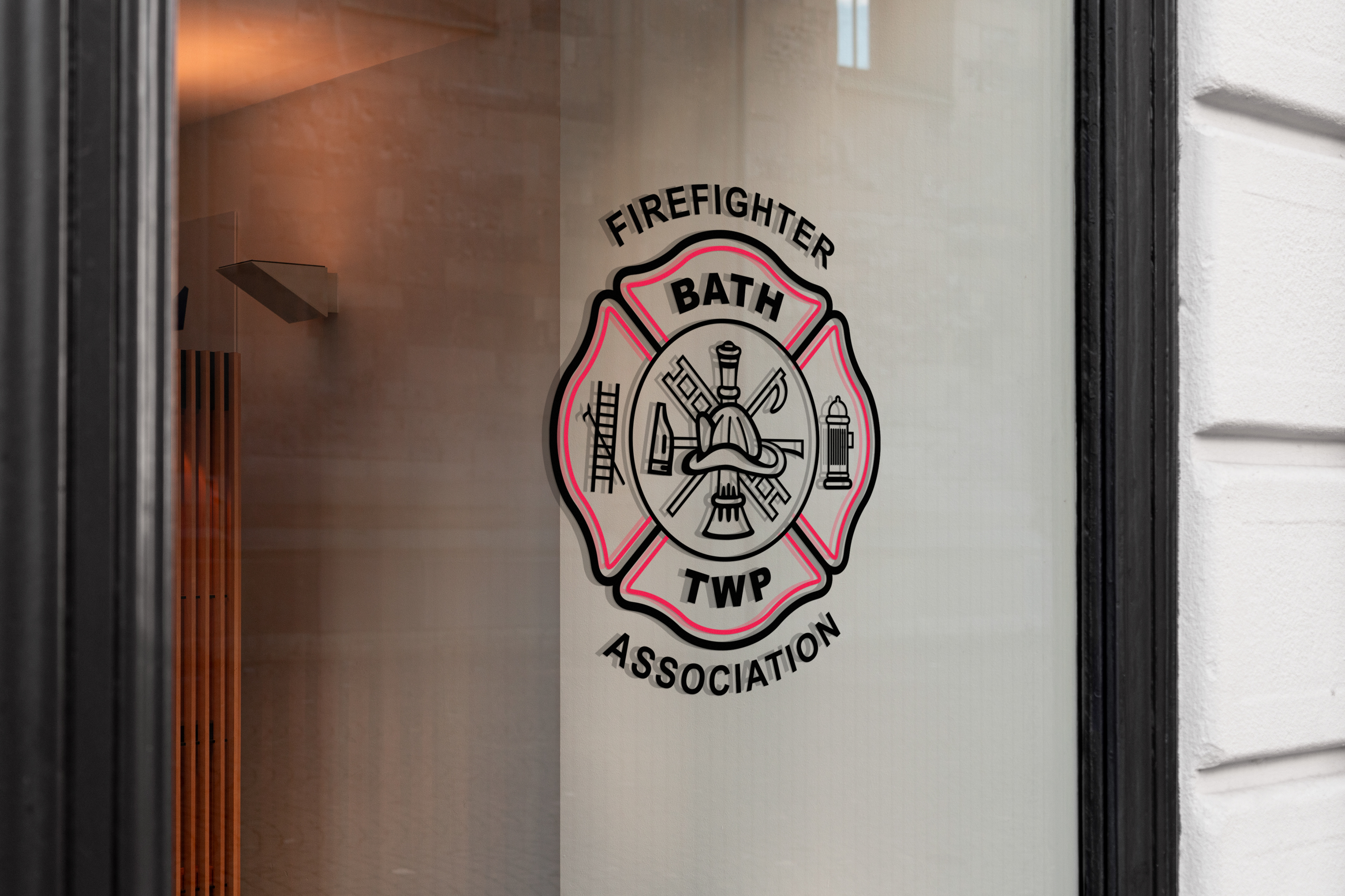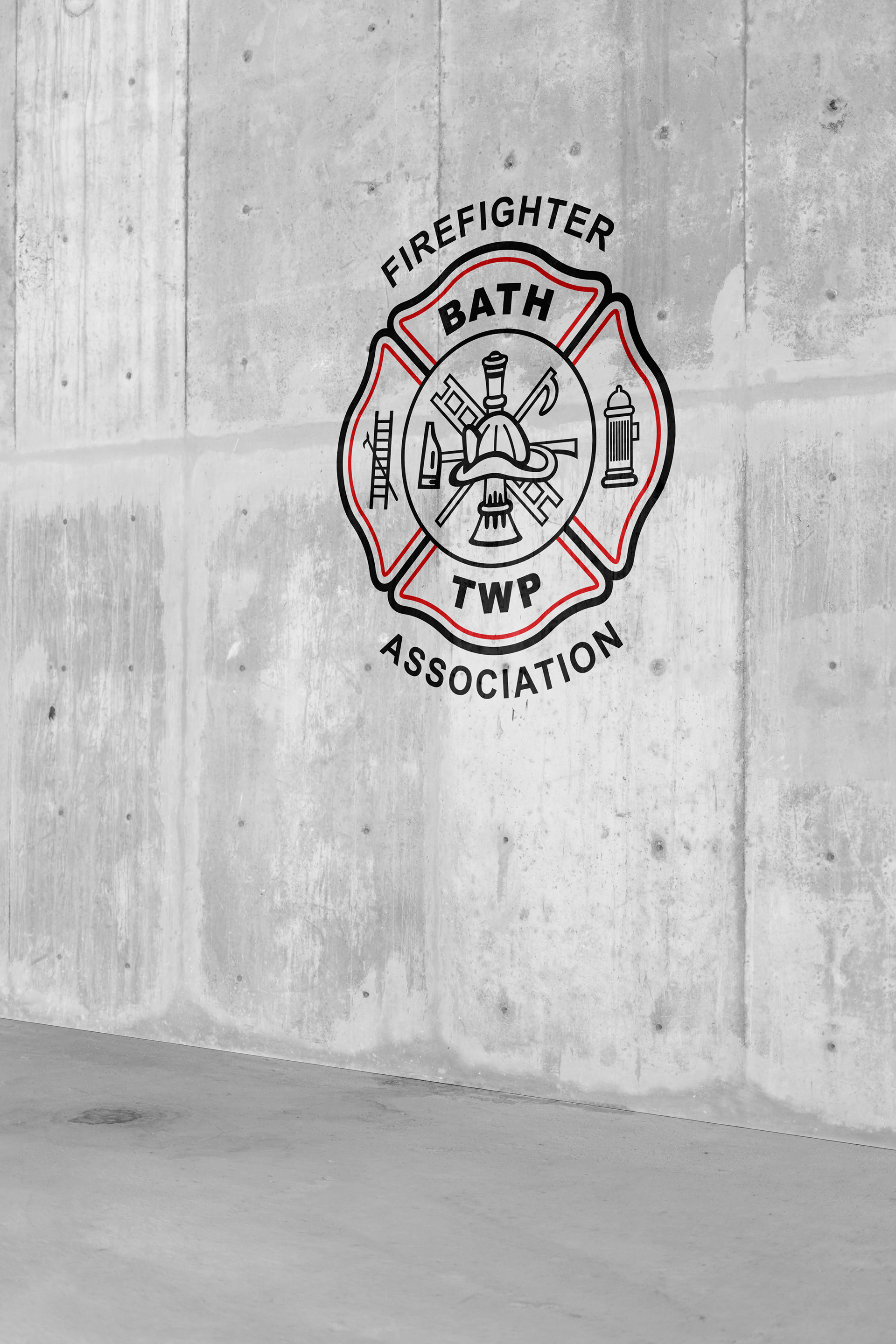

This was a project provided as a volunteer service for one of my local fire departments. Their association for making legal decisions needed a logo design that would match the rest of their branding while signifying the association itself. This quickly turned into a pet project that allowed me to learn the history of the Fireman’s Cross and various symbols that take up its scramble.
This was the initial round of proofs I developed, I looked to create something streamlined that could easily be adapted for logos outside of the association. They chose to move forward with adjustments to 2B.
Revisions were made to the prior chosen design, including filling in the pike pole on the ladder and making some adjustments to the text. This project was a good exercise in furthering my Illustrator skills, since I spent plenty of time learning new tricks to create the graphics, and recreating them over again in more simplified ways.
They wanted a pop of color, so we chose 2A as the finalized design.