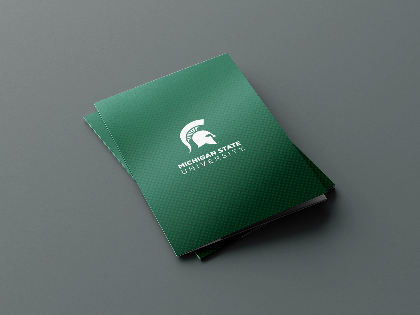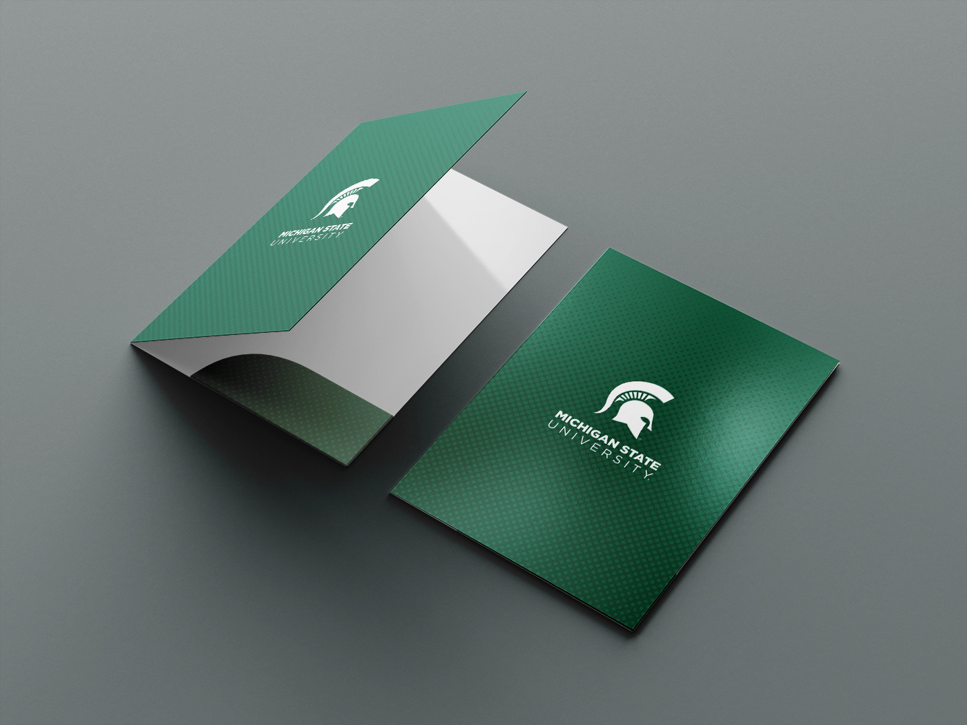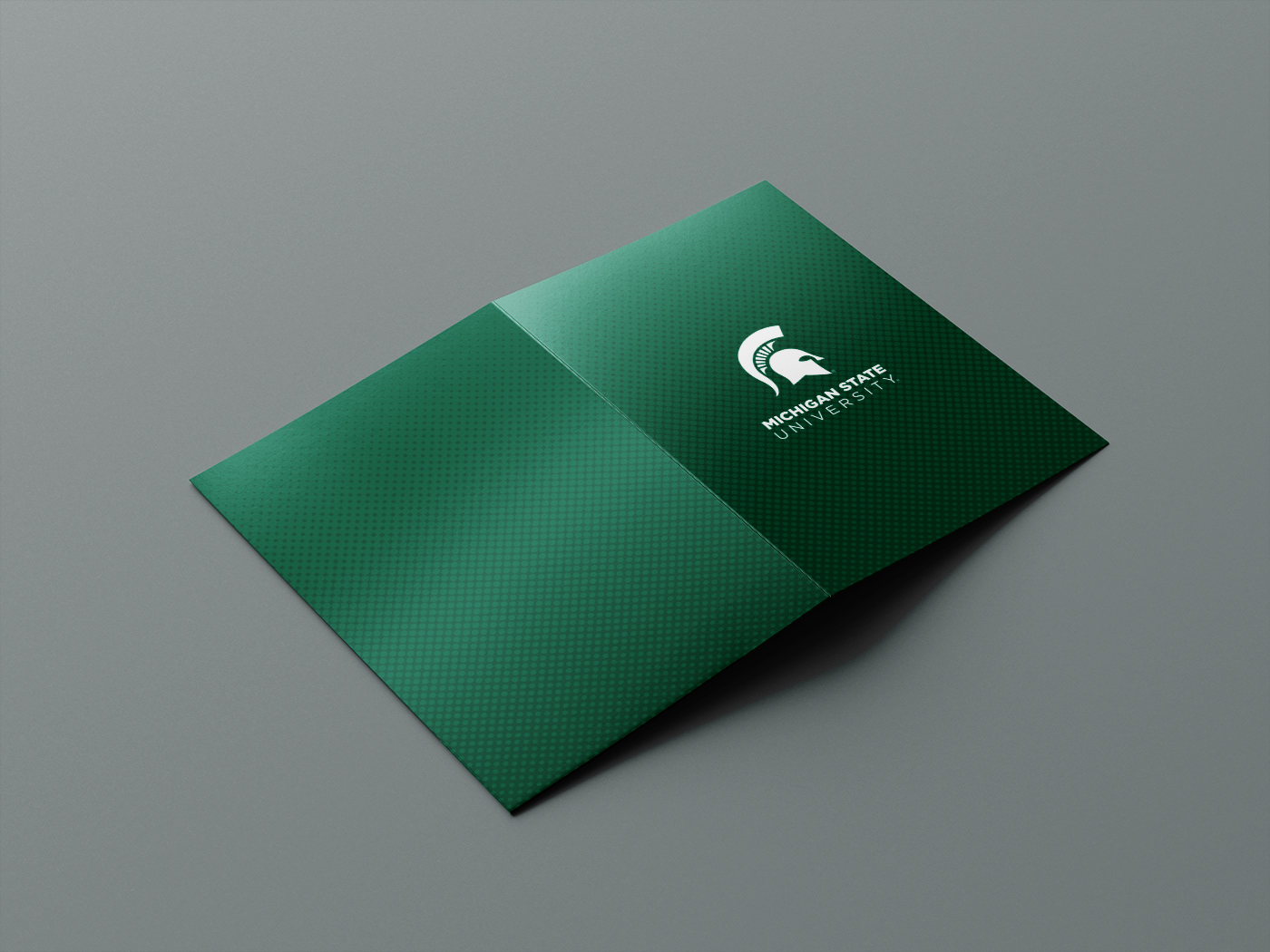


This folder design sought to answer a problem admissions counselors were having with their presentations. Folders to give out to students tended to slide together and fall right out of their arms when stacked. We had to choose a paper and ink process that would keep folders from getting too slippery, all while presenting university iconography in a concise and meaningful way for generic use.
This project taught me a lot about the printing process and how colors are layered together to create differentiation in how the half-tone dots appear.
This project taught me a lot about the printing process and how colors are layered together to create differentiation in how the half-tone dots appear.